
I. Introduction
Color is an omnipresent force in our lives, silently influencing our emotions, decisions, and perceptions. From the vibrant hues of a sunset to the carefully chosen palette of a corporate logo, colors speak a universal language that transcends cultural and linguistic barriers. In the realms of art and design, this language becomes even more potent, serving as a tool for creators to evoke specific feelings and reactions in their audience.
- I. Introduction
- II. The Basics of Color Psychology
- III. Emotional Responses to Individual Colors
- A. Red: Passion, Energy, and Urgency
- B. Blue: Calmness, Trust, and Stability
- C. Yellow: Optimism, Clarity, and Warmth
- D. Green: Nature, Growth, and Balance
- E. Purple: Luxury, Creativity, and Mystery
- F. Orange: Enthusiasm, Adventure, and Confidence
- G. Black: Sophistication, Power, and Mystery
- H. White: Purity, Cleanliness, and Simplicity
- IV. Color in Famous Artworks
- A. Van Gogh’s use of yellow in “Sunflowers”
- B. Picasso’s Blue Period
- C. Rothko’s color field paintings
- V. The Role of Color in Branding and Marketing
- A. Case studies of successful color use in logos
- B. Color trends in web design
- C. Cultural differences in color perception
- VI. Color in Architecture and Interior Design
- A. How color affects mood in living spaces
- B. Color theory in urban planning
- C. Biophilic design and the use of natural colors
- VII. The Science Behind Color Perception
- A. How the human eye perceives color
- B. Color blindness and its impact on design
- C. The psychological effects of color combinations
- VIII. Practical Applications of Color Psychology
- A. Choosing colors for productivity in workspaces
- B. Using color in therapy and healing
- C. Color in education: enhancing learning environments
- IX. The Future of Color in Art and Design
- A. Digital color: RGB vs. CMYK
- B. Virtual and augmented reality: new frontiers in color experience
- C. Emerging technologies in color manipulation
- X. Conclusion
The study of color psychology has roots dating back to ancient civilizations, but it wasn’t until the 18th century that it began to take shape as a formal discipline. Johann Wolfgang von Goethe’s “Theory of Colours” (1810) laid the groundwork for modern color theory, challenging Isaac Newton’s purely scientific approach and exploring the psychological impact of colors. Since then, artists, designers, and psychologists have continued to unravel the complex relationship between color and human emotion.
II. The Basics of Color Psychology
A. Primary, Secondary, and Tertiary Colors
At the foundation of color theory lie the primary colors: red, blue, and yellow. These are the building blocks from which all other colors are derived.
Secondary colors – green, purple, and orange – are created by mixing two primary colors.
Tertiary colors are formed by combining a primary color with an adjacent secondary color on the color wheel, resulting in hues like red-orange or blue-green.
Understanding this color hierarchy is crucial for artists and designers, as it informs color mixing and harmony in compositions.
B. Warm vs. Cool Colors
Colors are often categorized as either warm or cool:
- Warm colors (reds, oranges, yellows) are associated with energy, enthusiasm, and warmth. They tend to advance in space, making objects appear closer.
- Cool colors (blues, greens, purples) evoke calmness, serenity, and professionalism. They tend to recede in space, making objects appear farther away.
The interplay between warm and cool colors can create depth and atmosphere in both art and design.
C. Color Harmony and Contrast
Color harmony refers to the pleasing arrangement of colors, often based on their relationships on the color wheel. Common harmonious color schemes include:
- Complementary: Colors opposite each other on the color wheel (e.g., blue and orange)
- Analogous: Colors adjacent to each other on the color wheel (e.g., blue, blue-green, and green)
- Triadic: Three colors evenly spaced on the color wheel (e.g., red, yellow, and blue)
Contrast, on the other hand, involves the juxtaposition of different colors to create visual interest and emphasis. High contrast can make designs more dynamic and eye-catching, while low contrast can create a more subtle, harmonious feel.
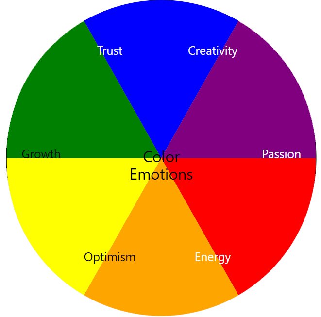
III. Emotional Responses to Individual Colors
A. Red: Passion, Energy, and Urgency
Red is a powerful and emotionally intense color. It’s associated with:
- Love and passion
- Excitement and energy
- Danger and warning
- Urgency and importance
In art and design, red is often used to draw attention, create focal points, or evoke strong emotions. For example, the red dress in Chris de Burgh’s painting “The Lady in Red” immediately captures the viewer’s gaze and suggests romance and allure.
B. Blue: Calmness, Trust, and Stability
Blue is widely regarded as one of the most popular colors, evoking feelings of:
- Calmness and serenity
- Trust and dependability
- Professionalism and stability
- Depth and wisdom
In corporate design, blue is frequently used to convey trustworthiness and professionalism, as seen in logos for companies like IBM, Facebook, and Ford. In art, blue can create a sense of tranquility or melancholy, famously exemplified in Picasso’s Blue Period works.
C. Yellow: Optimism, Clarity, and Warmth
Yellow is associated with:
- Optimism and cheerfulness
- Mental clarity and intellect
- Warmth and energy
- Caution (in certain contexts)
Artists like Vincent van Gogh often used yellow to convey joy and vitality, as seen in his famous “Sunflowers” series. In design, yellow is frequently used to grab attention, such as in warning signs or to highlight important information.
D. Green: Nature, Growth, and Balance
Green is strongly associated with:
- Nature and the environment
- Growth and renewal
- Balance and harmony
- Health and wellbeing
In art, green has been used to represent lush landscapes and evoke a sense of natural beauty, as seen in the works of landscape painters like Claude Monet. In design, green is often used in branding for eco-friendly products or to promote a sense of health and freshness.
E. Purple: Luxury, Creativity, and Mystery
Purple conveys:
- Luxury and royalty
- Creativity and imagination
- Mystery and spirituality
- Wisdom and dignity
Historically, purple was a rare and expensive color, reserved for royalty and the elite. In art, it’s often used to add depth and richness to compositions. In modern design, purple is frequently associated with luxury brands or creative industries.
F. Orange: Enthusiasm, Adventure, and Confidence
Orange is linked to:
- Enthusiasm and excitement
- Adventure and risk-taking
- Confidence and sociability
- Affordability (in marketing contexts)
Artists like Wassily Kandinsky used orange to inject energy and warmth into their abstract compositions. In branding, orange is often employed by companies wanting to appear friendly and confident, such as Nickelodeon or Fanta.
G. Black: Sophistication, Power, and Mystery
Black represents:
- Sophistication and elegance
- Power and authority
- Mystery and the unknown
- Mourning and solemnity (in Western cultures)
In art, black has been used dramatically in works like Kazimir Malevich’s “Black Square,” challenging perceptions of art itself. In design, black is often used for luxury products or to convey a sense of sophistication and power.
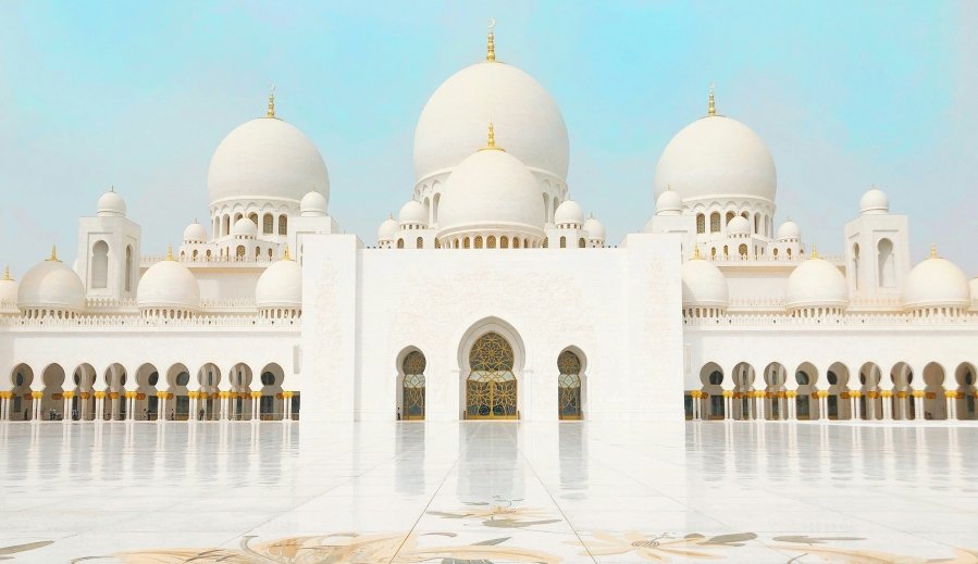
H. White: Purity, Cleanliness, and Simplicity
White is associated with:
- Purity and innocence
- Cleanliness and sterility
- Simplicity and minimalism
- New beginnings
Artists like Robert Ryman have explored the nuances of white in their work, creating seemingly simple yet complex compositions. In design, white space (or negative space) is crucial for creating balance and directing focus.
IV. Color in Famous Artworks
A. Van Gogh’s use of yellow in “Sunflowers”
Vincent van Gogh’s “Sunflowers” series is a masterclass in the emotive power of yellow. The vibrant yellows used in these paintings convey a sense of joy, vitality, and warmth. Van Gogh himself wrote, “The sunflower is mine, in a way,” highlighting his special connection to the color and subject.
The various shades of yellow – from pale lemon to deep ochre – create depth and interest, while also symbolizing the cycle of life, from the fresh blooms to the wilting flowers. The bold use of yellow against the blue background (its complementary color) creates a striking visual impact that has captivated viewers for generations.
B. Picasso’s Blue Period
Pablo Picasso’s Blue Period (1901-1904) is a powerful example of how a dominant color can set the emotional tone of artwork. During this time, Picasso primarily used shades of blue and blue-green, creating melancholic and introspective pieces that reflected his own emotional state following a friend’s death.
Works like “The Old Guitarist” and “Blue Nude” use the cool tones of blue to evoke feelings of sadness, loneliness, and introspection. The limited color palette forces viewers to focus on the emotional content and the composition of the pieces, rather than being distracted by a variety of hues.
C. Rothko’s color field paintings
Mark Rothko’s color field paintings demonstrate the raw emotional power of color itself. These large-scale works typically feature rectangular blocks of color with soft, fuzzy edges. Rothko believed that these simple compositions could evoke deep, primal emotions in viewers.
For example, his “Orange and Yellow” (1956) uses warm, vibrant colors to create a sense of energy and optimism, while the darker hues in works like “Black on Maroon” (1958) evoke a more somber, contemplative mood. Rothko’s work challenges viewers to experience color as a gateway to emotional and spiritual experiences.
V. The Role of Color in Branding and Marketing
A. Case studies of successful color use in logos
- Coca-Cola Red: The vibrant red used in Coca-Cola’s branding is instantly recognizable worldwide. It evokes feelings of excitement, boldness, and passion, aligning with the brand’s energetic image.
- Facebook Blue: The calming, trustworthy blue of Facebook’s logo helps reinforce the platform’s goal of connecting people and building communities.
- McDonald’s Yellow and Red: This combination of colors is designed to stimulate appetite (red) and create a sense of happiness and optimism (yellow), perfectly suited for a fast-food chain.
B. Color trends in web design
Web design color trends often reflect broader cultural and technological shifts:
- Minimalist palettes: Many modern websites use limited color schemes with plenty of white space, focusing on readability and user experience.
- Bold, saturated colors: With improvements in screen technology, designers are increasingly using vivid, attention-grabbing colors to stand out in the digital landscape.
- Dark mode: The rising popularity of dark-themed interfaces has led to increased use of darker background colors with light text, reducing eye strain and conserving device battery life.
C. Cultural differences in color perception
It’s crucial for global brands to consider cultural variations in color perception:
- White: Symbolizes purity and innocence in Western cultures, but is associated with mourning in many East Asian countries.
- Red: Signifies good luck and prosperity in China, but can represent danger or warning in Western contexts.
- Purple: Associated with royalty in many Western cultures, but with mourning in some Latin American countries.
Understanding these cultural nuances is essential for effective global branding and marketing strategies.
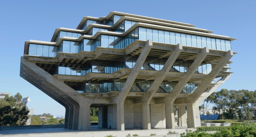
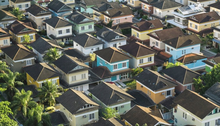
VI. Color in Architecture and Interior Design
A. How color affects mood in living spaces
The colors used in our living and working environments can significantly impact our mood, productivity, and overall well-being:
- Bedrooms: Soft, cool colors like light blue or lavender can promote relaxation and better sleep.
- Kitchens: Warm colors like yellow or red can stimulate appetite and encourage social interaction.
- Home offices: Greens and blues can enhance focus and productivity.
- Living rooms: Neutral tones with colorful accents can create a balanced, welcoming atmosphere.
B. Color theory in urban planning
Urban planners and architects use color to shape the feel of public spaces:
- Wayfinding: Bold, contrasting colors help navigate complex environments like airports or hospitals.
- Historical preservation: Colors can be used to highlight or blend with historical architecture.
- Community identity: Distinctive color schemes can give neighborhoods a unique character.
C. Biophilic design and the use of natural colors
Biophilic design, which incorporates natural elements into built environments, often relies on a palette inspired by nature:
- Earthy tones: Browns and greens can ground a space and create a sense of connection to the natural world.
- Sky and water hues: Blues can evoke feelings of openness and tranquility.
- Seasonal palettes: Changing color schemes to reflect natural seasons can help maintain a connection to the outdoors.
VII. The Science Behind Color Perception
A. How the human eye perceives color
Color perception begins in the eye:
- Photoreceptors: Cones in the retina are sensitive to red, green, and blue light.
- Color processing: The brain interprets signals from these cones to perceive the full spectrum of colors.
- Trichromatic theory: This explains how the combination of red, green, and blue signals creates our color perception.
B. Color blindness and its impact on design
Color blindness affects a significant portion of the population, primarily males:
- Types: Common forms include red-green and blue-yellow color blindness.
- Design considerations: Using patterns or symbols in addition to color can ensure information is accessible to all users.
- Color-blind friendly palettes: Tools and guidelines exist to help designers create inclusive color schemes.
C. The psychological effects of color combinations
Color combinations can create various psychological effects:
- Complementary colors: High contrast can create energy and vibrancy.
- Analogous colors: Can create a sense of harmony and cohesion.
- Monochromatic schemes: Can be calming and create a sense of unity.
VIII. Practical Applications of Color Psychology
A. Choosing colors for productivity in workspaces
- Blue: Promotes focus and intellectual thought, ideal for office spaces.
- Green: Reduces eye strain and can increase efficiency and focus.
- Yellow: In moderation, can promote optimism and creativity.
B. Using color in therapy and healing
- Chromotherapy: Alternative medicine practice using colors to heal.
- Art therapy: Color choice in art-making can reflect and influence emotional states.
- Healthcare settings: Thoughtful color use can create more comforting environments for patients.
C. Color in education: enhancing learning environments
- Elementary schools: Bright, primary colors can stimulate young minds.
- High schools: More subdued colors can aid concentration for older students.
- Subject-specific areas: Colors can be tailored to support different types of learning (e.g., creative vs. analytical subjects).
IX. The Future of Color in Art and Design
A. Digital color: RGB vs. CMYK
- RGB: Additive color model used in digital displays.
- CMYK: Subtractive color model used in printing.
- Expanding color gamuts: New technologies are broadening the range of reproducible colors.
B. Virtual and augmented reality: new frontiers in color experience
- Immersive color environments: VR allows for the creation of entirely new color experiences.
- Enhanced reality: AR can overlay digital colors onto the physical world, changing our perception of spaces.
- Personalized color experiences: Future tech may adapt color schemes to individual preferences or needs.
C. Emerging technologies in color manipulation
- E-ink and color-changing materials: Allowing for dynamic color changes in physical objects.
- AI in color selection: Machine learning algorithms assisting in color choices for design.
- Structural color: Inspired by nature (like butterfly wings), creating color through microscopic structures rather than pigments.
X. Conclusion
A. The ongoing importance of color psychology in art and design
As we’ve explored, color is a powerful tool in art and design, capable of influencing emotions, behaviors, and perceptions. From the masterpieces of Van Gogh to the latest developments in VR technology, color continues to play a crucial role in how we experience and interact with the world around us.
B. Encouragement for readers to be more aware of color in their surroundings
By understanding the principles of color psychology, we can become more conscious consumers of visual information and more effective creators. Whether you’re an artist, designer, or simply someone interested in the world around you, paying attention to color can enrich your experience and understanding of both art and everyday life.
As you move through your day, take a moment to notice the colors around you. How do they make you feel? How might they be influencing your thoughts and actions? By cultivating this awareness, you’ll gain a deeper appreciation for the subtle yet powerful ways that color shapes our world.